🧐 From prototypes to personalization
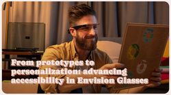
When I joined Envision, our primary goal was to create a seamless, accessible experience for people who are blind or have low vision. Envision Glasses—our AI-powered smartglasses built upon the Google Glass platform—are inherently audio-first devices. Every user interaction is driven by audible prompts rather than visual cues, similar to people using a screenreader on a smartphone.
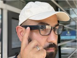
The touchpad on the Envision Glasses allows users to control the features on the Envision Glasses.
# From conceptualisation to prototyping to a first solution
During our initial phase, we experimented with different interface concepts. We tested with around 10 people, refining features and validating assumptions. From these prototypes, we discovered that grouping the Envision Glasses’ functions into categories provided a more intuitive experience than listing features in a single line.
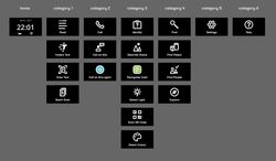
The first version of the Envision Glasses was launched and people loved it. This was also the moment our product was finally in the open and we could gather public feedback from many more users.
# Favorites: making essentials accessible
Despite the initial decision to use categories on the Envision Glasses, users and distributors reported that features like "Explore," a feature identifying objects in front of you, was buried under multiple swipes—sometimes up to eight from the home screen.
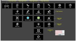
Screenshot showing the screens on the Envision Glasses. Although the screens are visual, most of the screenss are meant for internal use. The core design is that it's spoken out and thus the visual aspect is not important (at all).
Determined to streamline feature access, we spoke with early adopters and distributors. We did this both online, in-office and any chance we got at conferences and events. We brainstormed about certain solutions, but most importantly, really co-designed with our community. Their solution? A "Favorites" feature right next to the home screen. Users only needed one backward swipe to reach their top features.
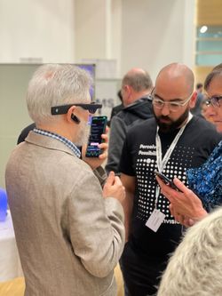
Ferkan gathering feedback and interacting with a user of the Envision Glasses and gathering feedback.
We introduced Favorites in Envision Glasses version 1.3, supported by two explanatory videos from Marinda:
Adoption soared, with roughly 30% of users leveraging Favorites within a month—double what we initially estimated. However, implementing a system to manage Favorites on the Glasses themselves was resource-intensive. To prioritize other developments, we limited customization to the Envision App, where users could configure their favorite features and have those changes instantly reflected on the Glasses.
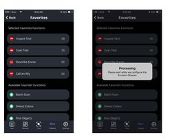
Screenshots showing Favorites screen on the app.
# Going hands-free with voice commands
We next focused on completely hands-free operation and launched Voice Commands in version 1.6. Suddenly, users could say “Open Explore” or “Start Scan Text” and immediately access that function.
# Listening, learning, and the more features menu
Although Favorites solved many accessibility concerns, we still saw areas for improvement. Our data showed that some users had many favorites or frequently changed settings, resulting in too many interactions needed on the touchpad. Originally, we entertained the idea of a “Focus Mode” that would show nothing but Favorites, but after some prototyping and user discussions, we found it might be too confusing and restrictive.

Screenshots showing possible design directions for Focus Mode and Favorites.

Screenshots showing possible directions on the Envision Glasses.
Instead, we wanted a more familiar solution—one that wouldn’t force users to learn a brand-new concept. We took inspiration from smartphones, where you can place secondary apps into a folder rather than having everything on the main screen. That sparked the creation of the “More features” menu, giving users the option to keep their most important functions in the main menu while tucking away additional tools in a separate, more organized area.
To develop this new interface, we ran multiple rounds of user interviews and brainstorming sessions. We aimed to find the perfect balance between simplicity and flexibility. By letting users choose which features stay in the main menu and which go into “More features,” we effectively cut down on navigation complexity for those who just want a few vital functions.
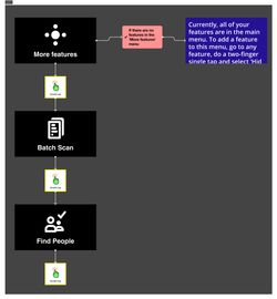
Screenshot showing the 'More features' menu on the Envision Glasses where users can put features they don't use frequently.

Screenshot showing the new (main) menu where only features are shown that most users utilise.
For a deeper look into how we made the Envision Glasses more personal, we created a video (starring me, ha):
This evolution highlights a key takeaway: rather than reinventing the wheel, we often achieve the best results by using solutions familiar to our users—especially those who aren’t too tech-savvy. The folder concept is something most people understand from smartphones, which made it feel natural and approachable.
This approach allowed us to simplify the Envision Glasses for distributors, making it easier to demonstrate the product without overwhelming potential new users—many of whom are older and not very tech-savvy. At the same time, we improved productivity and speed for our tech-savvy users by streamlining access to key features like “Instant Text,” which uses Optical Character Recognition to instantly read aloud any text in front of the glasses.
# Personal key learnings from this UX Evolution
- Always prioritize user feedback: Real-world experiences guide product decisions.
- Simplify but empower: Minimize complexity while offering personalization.
- Iterate continuously: Keep adapting and improving instead of chasing one perfect solution.
- No need to always reinvent the wheel: If a familiar approach works, use it, especially for non–tech-savvy audiences.
# So, what’s next?
Personalization remains essential as we move forward. Everyone has distinct preferences, and we see a future where natural language interaction is inevitable. Our next big leap is “ally,” a fully conversational interface that removes the need for structured menus or complex gestures. Imagine just talking to Envision Glasses: “What’s on this document?” “Read this English magazine, but give the output in Dutch.” “Turn up the volume.” etc.
By focusing on conversation, ally aims to make the Envision Glasses more intuitive than ever.
Thank you for reading this inside look into our design and development process. I’m writing this as a Product Manager at Envision, and I hope it gives insight into how we keep innovating in the accessibility space. To learn more about Envision Glasses, visit LetsEnvision.com/glasses.